|
Community Links |
Social Groups |
Pictures & Albums |
Members List |
Search Forums |
Advanced Search |
Go to Page... |
|
Thread Tools |
02-18-2010, 10:27 PM | #1 |
Hisstank.Com General
Join Date: Feb 2003
Location: Greensboro, NC
Posts: 13,759
|
Vadersquest & Shogi present: a Review of Action Force: Red Dawn #3 "Man of Action"
Over the last few years, I have had a strong interest in foreign G.I Joe stories; most notably Action Man and Action Force from Britain . These stories are important to the overall history of G.I Joe and are quite fun to read. As the fan base grew so did the thirst for new and original Joe stories. The Red Dawn series helps to fill that need and does it very well. The Action Force: Red Dawn comic series is a fan made comic that is said to be based during the G.I. Joe America’s Elite comic series, but also has stories concerning Action Force team member’s origins and other events that happened during the original Battle Action Force comic run in the early 1980’s. This issue deals with the origin story of Action Man joining Action Force. It’s important to note that the Action Man character used here seems to be the Adventurer with amnesia from the 1995 DiC Cartoon and not the Extreme Sports star who could “Amp it up” from the 2000 Mainframe CGI show. Having never seen the DiC Action Man cartoon and only vaguely remembering the CGI show, this is my first real exposure to the Action Man story. There is some back story in the beginning of the book to familiarize you with Action Man, and then we start his story as a part of Action Force. Now the one thing to remember is this book is fan made. The art is not going to be at the IDW level but that’s perfectly okay; this adds character to the overall book and story. When I read this issue I did find myself looking over the art with a fine tooth comb and there were some things that bothered me. Consistency was lacking throughout the book. One panel you would have a killer scene and the next you would be looking at something that sort of resembles a character you knew. Lines were blurry and some panels had insufficient transitions to the next. There was also the lack of emotion in some of the art work. For example: The last page has Gung Ho screaming no. This did not work for me. The emotion was lacking and the overall panel was a miss. This can lead to a static feeling for the book and story. Now if the art would have been popping, this scene would have blown me away. I can handle the digital reuse of images and if done right can save the producer or artist a lot of time. This worked well for me and I had no qualms with this. If the art would have been consistent the story would have been propelled along. The thing to remember is art helps to spin the story and is a crucial stepping stone within the overall matrix of the series. Art tells a story all in its own. The story itself was confusing and I will say this now. This issue is not a good jumping on point. You walked right into the middle of a larger story and this made for a tough read. Now do not get me wrong, the other issues are stellar (excellent art and story telling) but this issue does not work for me. I still plan to read other issues as this is not a deterrent for me. We all know the big boys such as IDW and Marvel miss the beat from time to time and fans stick with them. I love the concept and I see the heart that goes into the series. This means a lot and I just wish more of that would have been shown in this issue. Still, I am a fan and I will continue reading the series for the conceivable future. I agree with what Vadersquest said, the story within a story technique used here makes for a slightly confusing read, especially if this is the first comic of the series you’ve read. The artwork in this book also gives a feeling of confusion as it seems there are 3 different art techniques at use here. I believe this is due to the digital reuse of artwork. When used properly, the digital reuse of artwork in a comic book is a valuable time saving technique that is hard to notice. This is shown effectively in the panel with the squad of Red Shadows creeping up on the village. Only one actual body was drawn and the rest are copies (with slight alteration) of the originals. This technique was also used on the shots of the airplane flown by Red Wolf. One small panel has the airplane and the same airplane is used in a splash page. This would be a fine reuse of artwork except that the original was obviously smaller than the splash page since the airplane in that picture is fuzzy and pixilated. (This typically happens when you over-enlarge a small picture) I noticed the same fuzziness and blurriness on a few other panels as well as the reuse of artwork from the 1980’s Battle Action Force comics. Looking at previous issues, you can see the artist’s personal style and it’s a very good drawing style that I wish was fully represented in this comic instead of the mish mash of multi artist’s styles that is shown here. The section where Action Force is fighting the Red Shadows in the village is where you can see the artist’s style shown well. These sequences show some good, dynamic perspective angles. If the whole book was drawn like these pages, there would be very little to complain about. Like Vadersquest mentioned, I have a slight nitpick with some of the artwork in this book not fully conveying what the story is saying. In two different panels, you have a character supposedly showing some emotion based on what they’re saying, but the artwork shows them as fairly stoic. This has less impact on the reader. Again, in previous issues, this was not a problem. The artwork and story would propel you along and would get the reader to connect with the characters on an emotional level. Unfortunately, that’s not the case with this issue. I believe this issue was a misstep on a very promising fan comic series. The previous issues showed a lot more consistency in the artwork and thrilled me much more than this particular issue. I would recommend reading previous issues before you read this one. Vadersquest Shogi To read this comic in it's entirety, click here: FORUM • Login |
02-18-2010, 11:14 PM | #2 |
Iron Grenadier
Join Date: Feb 2009
Location: Japan and the USA
Posts: 774
|
good and fair review i think!
|
02-19-2010, 12:33 AM | #3 |
Hisstank.Com General
Join Date: Feb 2008
Location: Charlotte, NC
Posts: 12,521
|
I think it was. I know I cannot wait to read the next issue.
|
02-19-2010, 02:17 AM | #4 |
father of bullie baby
Join Date: Jul 2009
Location: Staten Island NY
Posts: 534
|
the art work looks like the old 60"s marvel cartoons(thor,fan4,capt american
|
Similar Threads | ||||
Thread | Thread Starter | Forum | Replies | Last Post |
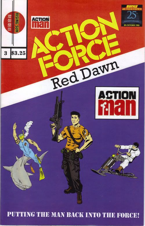
Action force red dawn comic series | THE RED SHADOWS | Comic Books Discussion | 13 | 06-30-2009 06:45 PM |
Gordon-Levitt says "That's not my face" to Cobra Commander Action Figure | SNAKE EYES | G.I. Joe Live Action Movie | 75 | 05-01-2009 04:50 PM |
ACTION FORCE RED DAWN #1 REDUX- the print edition | jamarmiller | G.I. Joe Buy Sell Trade | 0 | 10-24-2008 08:53 AM |
Action force red dawn #1 redux | jamarmiller | G.I. Joe General Discussion | 0 | 09-04-2008 10:19 PM |
ACTION FORCE : RED DAWN -----Coming 2008 ( NEW COMIC ) | jamarmiller | G.I. Joe General Discussion | 4 | 02-23-2008 11:19 PM |
|
|