

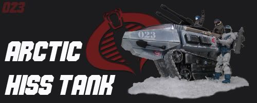
|
|||||||


 |
|
|
Thread Tools |
 07-07-2008, 01:05 PM
|
#1 |
|
has been warned
Join Date: Oct 2007
Location: Richmond, VA
Posts: 2,039
 |
__________________
 CHECK OUT MY FOR SALE, FOR TRADE LIST BELOW http://www.hisstank.com/forum/g-i-jo...ves-fs-ft.html Feedback thread http://www.hisstank.com/forum/buy-se...ectorxd-2.html |

|

|
|
07-07-2008, 02:34 PM
|
#2 |
|
Banned
Join Date: May 2007
Location: blasdell, ny near buffalo
Posts: 8,433
|
|
|
|
|
|
07-07-2008, 02:39 PM
|
#3 |
|
Lt. Falcon
Join Date: Dec 2007
Location: Miami
Posts: 2,162
|
|
|
|
|
|
07-07-2008, 03:01 PM
|
#4 |
|
Cobra Viper
Join Date: Aug 2006
Location: Middle River, Maryland
Posts: 280
|
|
|
|
|
|
07-07-2008, 03:06 PM
|
#5 |
|
has been warned
Join Date: Oct 2007
Location: Richmond, VA
Posts: 2,039
|
__________________
CHECK OUT MY FOR SALE, FOR TRADE LIST BELOW http://www.hisstank.com/forum/g-i-jo...ves-fs-ft.html Feedback thread http://www.hisstank.com/forum/buy-se...ectorxd-2.html |
|
|
|
|
07-07-2008, 03:13 PM
|
#6 |
|
Crimson Guard
Join Date: May 2008
Location: michigan
Posts: 4,470
|
|
|
|
|
|
07-07-2008, 03:18 PM
|
#7 |
|
JOES BEFORE HOES
Join Date: Oct 2007
Location: Westland, MI
Posts: 5,939
|
__________________
  |
|
|
|
|
07-07-2008, 03:20 PM
|
#8 |
|
Money first!
Join Date: Jan 2008
Location: Michigan
Posts: 2,181
|
__________________
  |
|
|
|

|
07-07-2008, 03:20 PM
|
#9 |
|
Plastic lover
Join Date: Sep 2007
Location: Over The Rainbow!
Posts: 8,395
|
__________________
Anything but to face ourselves as we are... |
|
|
|
|
07-07-2008, 03:20 PM
|
#10 |
|
Mercenary for Hire
Join Date: Feb 2008
Location: City of lost angels, Cali
Posts: 2,064
|
__________________
*****FeedBack thread***** http://www.hisstank.com/forum/showth...=sgt.bludhound ****for sale thread**** http://www.hisstank.com/forum/g-i-jo...ft-thread.html |
|
|
|
|
«
Previous Thread
|
Next Thread
»
|
|

| Sponsors |
      |